National Almond Day
Design the logo and campaign branding for Blue Diamond’s National Almond Day event, celebrating everything almonds & the grand reveal of the Nutty Cruiser™.
To celebrate National Almond Day and the start of their "Bring Your Flavor" national tour, Blue Diamond approached us to design a campaign logo and develop cohesive branding aligned with their vibrant Snack Almonds identity, characterized by electric colors and an energetic tone that reflects their bold and flavorful portfolio of almonds.
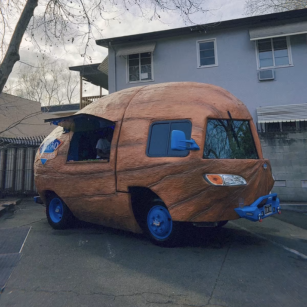
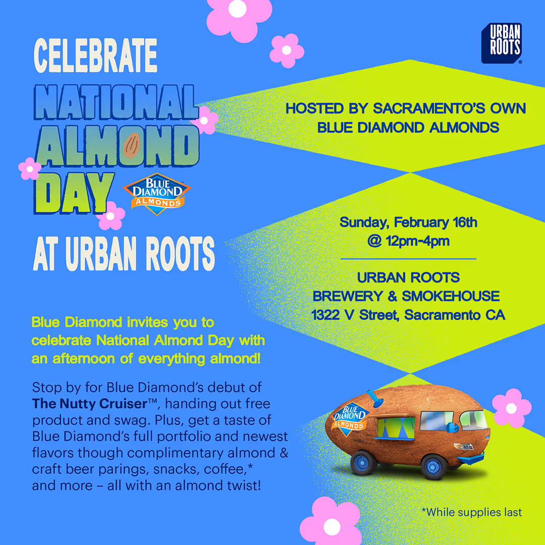
The event was held at Urban Roots Brewery & Smokehouse, in their hometown of Sacramento, California. They also wanted to promote the brand new Nutty Cruiser™ and a special one-day sale for National Almond Day.
Concept Development
To kick off the branding, I focused on developing a vibrant and versatile event logo that could extend across various applications while staying true to the bold tone of Blue Diamond’s Snack Almonds line.
Using their neon green and sky blue color palette as a foundation, I explored multiple directions to balance fun, brand alignment, and visual clarity. My goal was to create a system that felt festive and energetic while being scalable for signage, print, and digital use.
Logo Explorations
Logo A: Diamond Emblem
Structured and symmetrical, this version took cues from the Blue Diamond logo itself. Framed in a diamond-shaped container, almond blossoms frame the logo, with an almond shape in the “o” of “almond” to bring in playful, brand-specific detailing.
Logo B: Almond Lockup
A bolder, more compact option, this logo used the almond shape as the main structure, with the logotype following its curves. This version omitted floral elements for a more minimal and playful mark that focused purely on the core product.
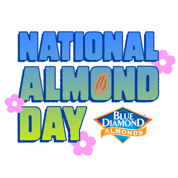
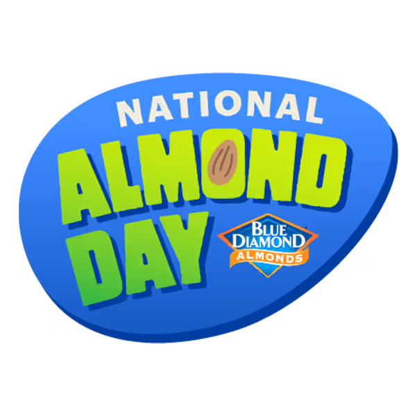
Logo C: Wordmark with Blossoms
A cleaner, more typographic approach, this logo paired simplified letterforms with a minimal flower icon. Without a background shape, I added a drop shadow and stroke for flexibility across colored or image-heavy backdrops.
Design Challenge
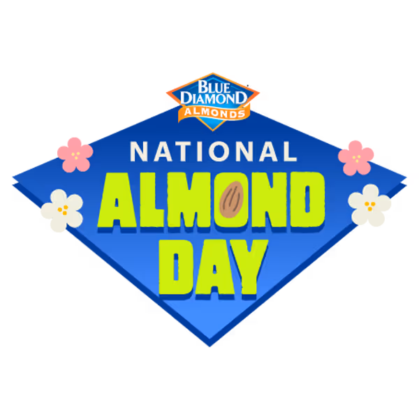
Incorporating delicate almond blossoms into a scalable logo proved tricky, especially for smaller applications where fine details can get lost. While the client initially requested floral elements, I proposed variations that reduced complexity without losing charm. In the end, they selected the Wordmark (Logo C) for its versatility, clarity, and visual punch, a strong foundation for the rest of the campaign branding.
Bringing It to Life
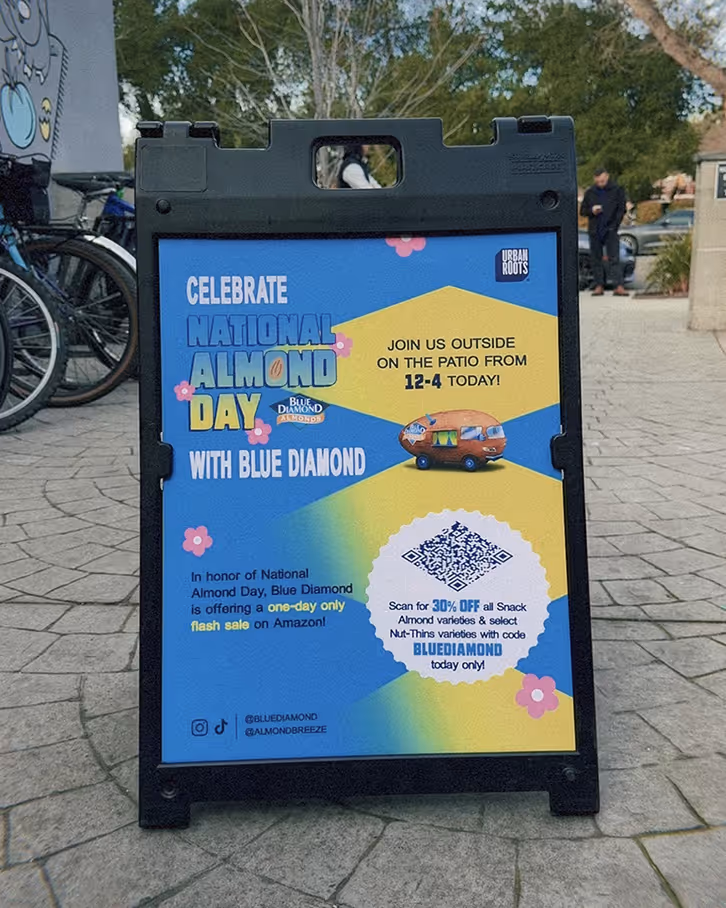
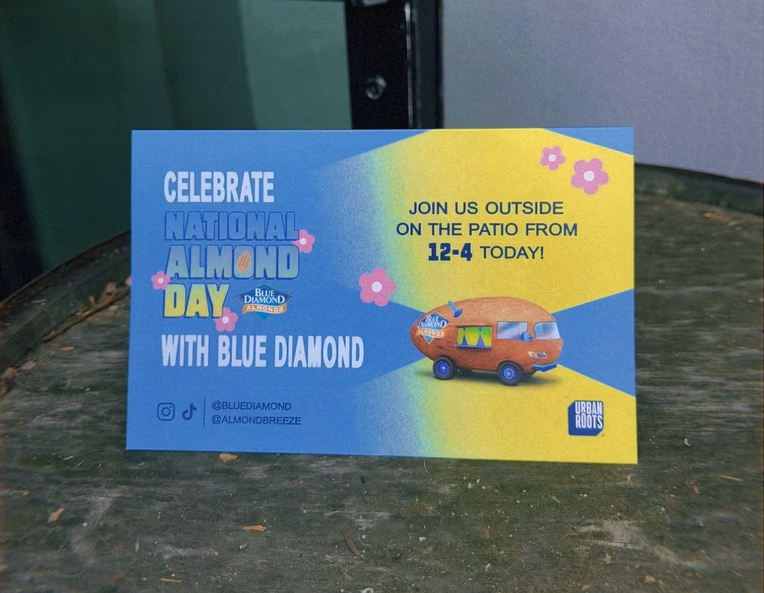
Once the final logo was selected, I built out the event’s visual identity, starting with the invitation design.
InvitationThe chose layout reflected the logo's energy with:
- A diamond pattern with a grainy gradient texture from the brand guidelines
- Floral motif pulled directly from the logo
- Dark navy font color to visually tie in with Urban Roots' logo
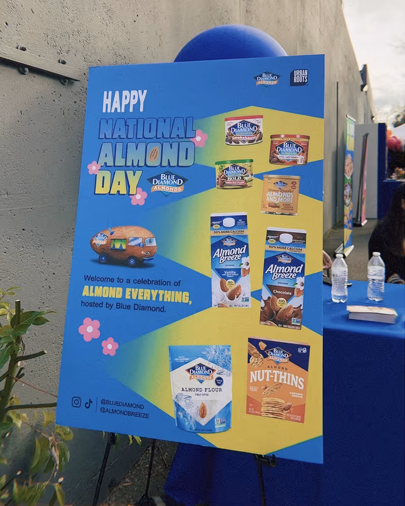
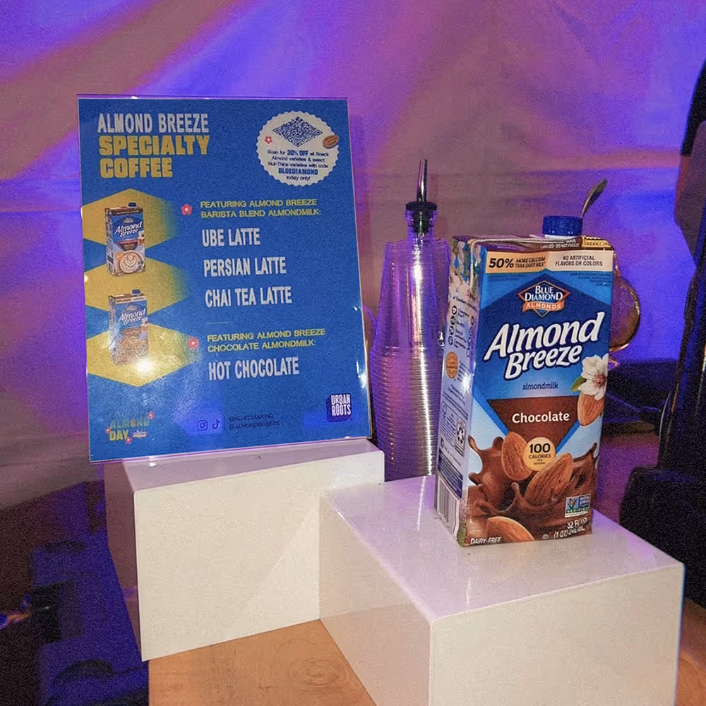
Event SignageWorking with Milly, I extended the look and feel across event signage, from directional banners to punch cards, creating a consistent branding that brought it to life across different touchpoints.
A Nutty Success
250+ Attendees
The event surpassed the original projection of 200. Even print materials, like the punch cards, ran out mid-event, a sign that the campaign had strong traction and buzz.
Local Buzz & Social Reach
Local influencers helped amplify the event though social media promotion that drove excitement and foot traffic throughout the day.
A Flavorful Launchpad
The event served as the kickoff for the nationwide Nutty Cruiser™ tour, energizing both the local community and the brand team with a successful, well-attended celebration of all things almond.
Final Deliverables