Parent's Path Art Collection
Design a logo and identity for a curated art collection that captures the emotional highs and lows of parenthood.

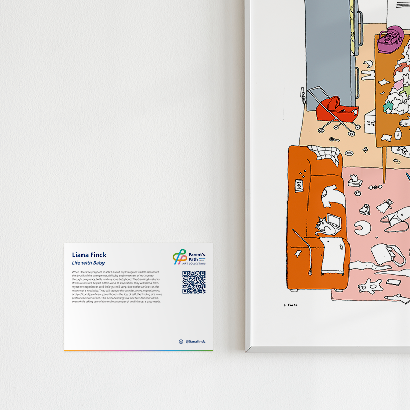
Philips Avent collaborated with artists who are recently new parents to share their experience of becoming a parent through their art. They wanted to highlight the ups and downs of parenthood and the reality and essential practices of of self-expression, self-care, seeking and accepting support from family and friends, knowing parents can feel left out of the picture when prioritizing baby.
Capturing the Unspoken Journey
The clients wanted a symbolic, emotionally resonant logomark that reflected both the complexity and joy of parenting, and one that could live comfortably alongside the Philips Avent logo in a variety of digital and print applications.
The design needed to feel honest, expressive, and deeply connected to the collection's purpose.


From Literal to Layered
I began by exploring literal representations of handprints and path motifs to reflect connection and growth between parent and child. While visually clear, the initial drafts felt too surface-level and didn’t fully speak to the depth and vulnerability of the featured artwork.
In the next phase, I took a more abstract approach, drawing inspiration from journeys and transitions. One early concept used acronym-based circles in Avent’s brand colors, with extended lines to symbolize a path. However, the composition unintentionally evoked subway maps, too structured and impersonal for a project about emotional experience.After continued exploration, I landed on a logomark that elegantly merged meaning and form:

Journey of Parenthood in a Symbol
After continued exploration, I landed on a logomark that elegantly merged meaning and form:
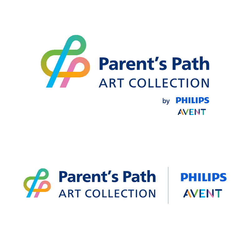
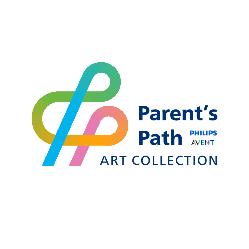
- A continuous line that loops and curves, echoing the highs and lows of the parenting journey
- The line forms two interwoven Ps, representing both the name Parent’s Path and the relationship between parent and child
- A gradient color shift ties back to Avent’s branding while symbolizing emotional and personal growth
Multiple lockups were created to pair with the Philips Avent logo; the final selection tucked the logo beneath the linework, allowing the new mark to lead while still maintaining brand presence.
Bringing the Visuals to Life
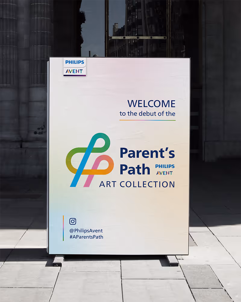
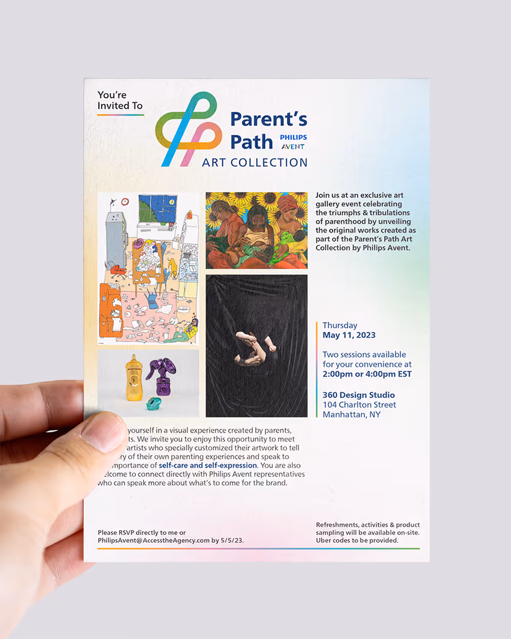
With the logo finalized, I expanded the identity across event materials, starting with an invitation that leaned into the artistic and emotional tone of the collection.
The invitation design used:
- Soft background gradients to reflect depth without overpowering the art
- A graphic-forward layout that stepped outside the brand’s usual comfort zone
- Gradient lines pulled from the logo are used as visual dividers and accents to highlight key details
This direction carried through to the event signage and takeaway favors, building a cohesive and emotionally resonant experience that honored the artists and their stories.
A Lasting Impact
An Evening of Connection
Media and guests came to support the artists, listen to their personal stories, and celebrate the realities of new parenthood.
Ongoing Digital Presence
Philips Avent continues to host the stories and artwork on their website, extending the life of the collection beyond the event.
Community Conversations
The project sparked conversations across social media, inspiring others to share their parenting journeys and experiences, proving that design rooted in emotional storytelling can truly bring people together.
Final Deliverables