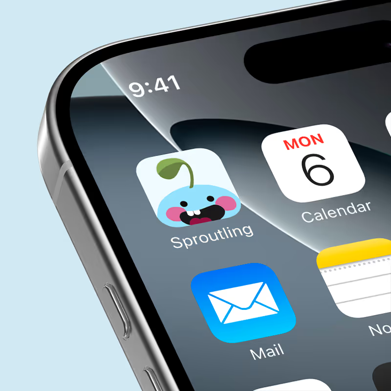
Sproutling
Design a mobile app and brand identity for a water intake tracker app.
Amid the challenges of the pandemic, college students struggled to maintain healthy habits, particularly staying hydrated. Despite understanding the importance of water intake, many lacked the motivation, tools, or awareness to meet their daily needs. Sproutling is a gamified hydration app designed to make drinking water simple, fun, and rewarding. By combining user research, market analysis, and playful design, Sproutling addresses key pain points and encourages consistent hydration through an empathetic and engaging digital experience.
Designing for Motivation
While the goal of tracking hydration was clear, the true challenge was motivating users to return daily. Most hydration apps were either too technical or lacked incentive. We needed to create something that felt fun, empathetic, and habit-forming, something people would want to come back to, not just feel like they should.
Research on Water Consumption
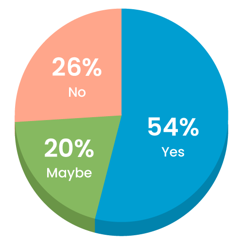
Do you think you drink enough water everyday?
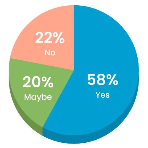
Do you know how much water you should drink?
Do you think you should be drinking more water?
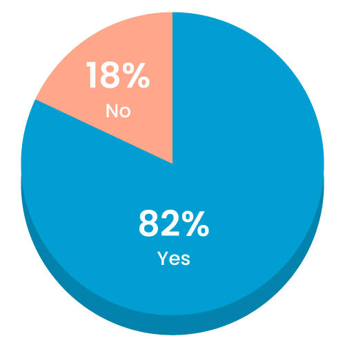
My partner and I began with user research, distributing a survey to 50 college students. The data was clear: Over 80% acknowledged they should be drinking more water, yet 53% admitted they still didn’t meet their daily intake.
We also analyzed competitor apps and found key shortcomings:
- Overly complex user flows
- Limited input customization
- Little to no motivation or reward for continued use
These findings shaped our product strategy: Sproutling would be simple, gamified, and emotionally rewarding.
Key UX/UI Features

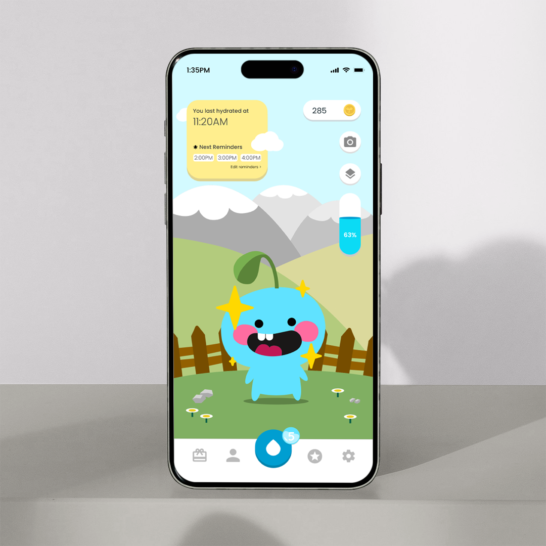
Fast Input
Pushing the button quickly inputs fluid intake rather than putting in exact numbers every time.
Challenges
Daily challenges encourage users to open the app and rewards when completed.
Reward System
Coins can be redeemed for accessories, new sprouts, backgrounds, etc.
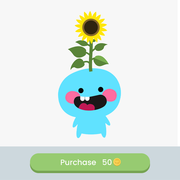
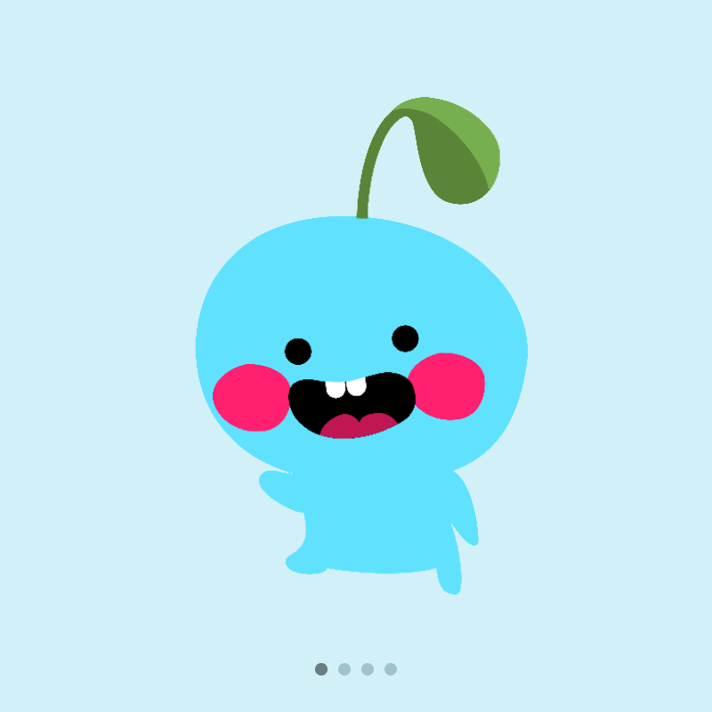
Sproutling Avatar
Levels of empathy when Sproutling is dehydrated and personalization to make it fun.
Our goal was to design an app that made hydration simple, fun, and motivating. Key features include fast input, challenges, reward system, and the Sproutling avatar. Together, these elements created a gamified experience that motivates users to stay hydrated while fostering a sense of connection and achievement.
Evolving the Avatar
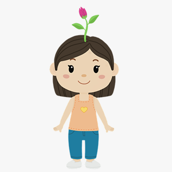
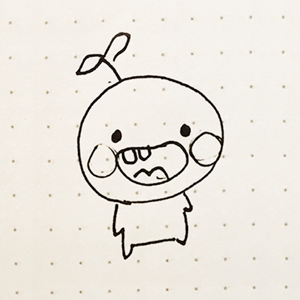
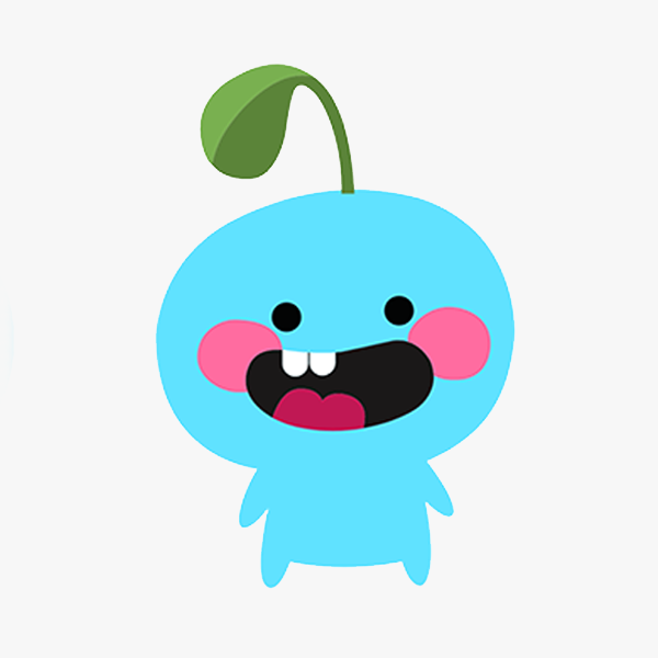
Initially, the avatar was a human character with a growing plant, but it felt cluttered and drew focus away from the sprout itself. After a few rounds of iteration, Chako sketched a simple round character that felt friendly, expressive, and instantly lovable. That became the heart of Sproutling.
Sproutling Grows as You Grow
The plant grows as the user hydrates, but withers if neglected, creating a subtle sense of empathy that encourages consistency. Users can earn coins to unlock accessories and customize their Sproutling, or even start new seedlings once their plant reaches full maturity, turning the experience into a collectible, evolving garden.
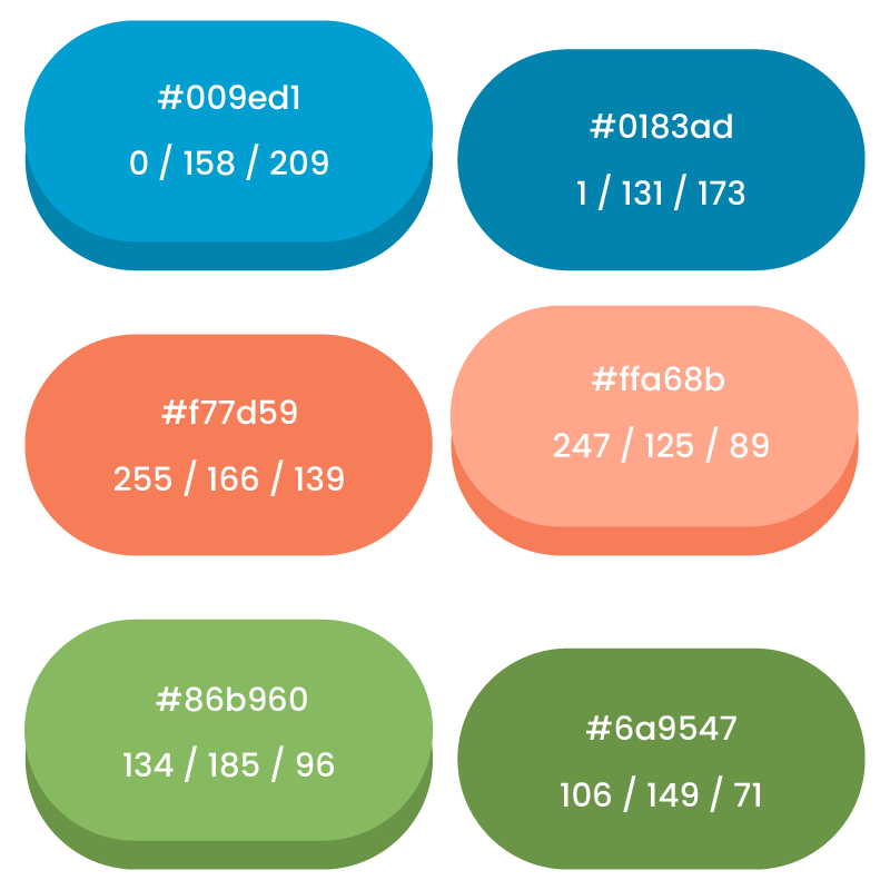
Visual System
Sproutling’s identity uses vibrant colors grounded in blue to reinforce water and wellness. The UI combines solid color backgrounds with playful accents and 3D-style buttons that add depth and energy. The visual consistency helps tie the app together, keeping it fun without overwhelming the user.
Beyond visuals, we added helpful tracking features:
- Hydration tracking based on age, weight, and height
- Mood input to explore correlations between hydration and well-being
Building for Behavior Change
By the project’s end, we had successfully designed a brand identity and user experience that made hydration feel intentional and fun. We received positive feedback on the app’s emotional tone, visuals, and avatar design.
Future Opportunity: Social Motivation
One key suggestion we received was to incorporate a community aspect, allowing users to connect with friends, share hydration milestones, and even “nudge” each other to drink more water. A social component could add friendly competition and further extend user engagement through shared accountability.
Final Deliverables